Good user-approved designs take time to finalize. Professional UX designers use a process to fine-tune their designs. Implementing design principles improves the final product. Let's take a look at how design principles are incorporated and improve the user experience.
The Evolution of a Design
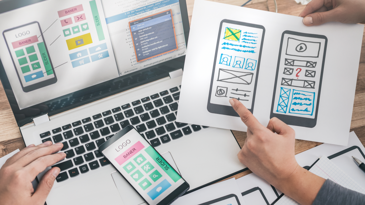
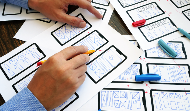
Before a polished product is provided to the user, the design goes through phases. Designs start off as sketches. Designers use the ideation phase to figure out what basic components they should add to their designs. Low-fidelity mockups are created and then turned into the first prototype. Some designers conduct usability tests on their low-fidelity prototypes to ensure functionality before advancing design. After a successful usability test, high-fidelity prototypes are made. High-fidelity prototypes closely resemble the finished product. Learn how design principles are used throughout the product process.
Top Six Design Principles
1. User-Centered

A designer's number one goal is to meet the user's needs. It’s important to keep your designs objective and focus on solving the user challenge. Being empathetic towards your user would allow you to implement user-specific functions in your design. This is why it is important to conduct research prior to starting a project. Research methods include competitor audits, surveys, interviews, and past case studies. This background information helps you to come up with solutions. Throughout the design, phase solving the user problem is the target goal.
2. Consistent

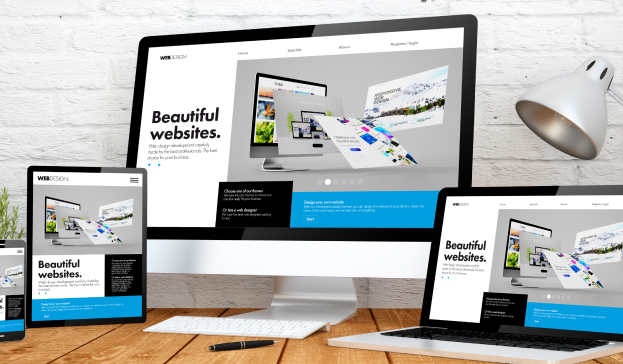
Inconsistent functionality is a big user pain point. The user flow should maintain a sense of stability. Therefore, abrupt changes in typography, iconography, color and other design structures should be discouraged. Instead, it's important to maintain the design language throughout. Consistency is also needed across platforms. Both mobile and desktop prototypes of the same product should share a design system. Designers use sticker sheets to keep up with the components they will use in a particular design system.
View Airbnb’s Design System here.
3. Contextual

The context in design focuses on the user's situational needs. Think about where and when a user will use your product. User needs can change depending on the environment, socio-emotional changes, and physical accessibility. Designers consider this when implementing specific functions. A designer for a roadside assistance app will consider that the user is in a stressed mood and in need of help. Therefore the typography is limited and the user flow needed to achieve the goal, of getting roadside assistance, is simplified.
4. Iterative

Iteration is the process of enhancing or making a product better. The design process doesn’t stop on the first try. It could take a few tries before your design meets the users' needs. Maybe one need is met and you discover another user problem. This is why revisionary systems are put into place. Design critiques and usability studies are used to provide design feedback. In design critiques sessions the designers present their current design to the team. The other team members complement what they like about the design and then give suggestions. This constructive criticism is used to improve the overall design. Usability studies are another great way to receive feedback and most important. In usability studies, users test the project prototype. They then give feedback on their interactions with the prototype. The iteration process assures your final design is user ready.
5. Hierarchy and Information Architecture

How you organize your design is considered early in the ideation phase. Designers use methods such as storyboarding, crazy 8’s, and site mapping to figure out the basic structure of their design. Afterward, the initial wireframes are created. Users can find the information they need using hierarchy. This method assures that what the user typically needs from an app is easily accessible and hard to miss. For example, when you use a food ordering app you can expect to find a colored checkout button at the bottom of the app. A designer creating a food ordering app understands that the checkout button placement is an industry norm. On websites, you would find sizable headers to grasp the reader's attention. Large-sized typography alerts the readers and shows them where to go. The size, shape, and placement of components in your designs guide users.
6. Accessible

Designers want to make sure that all users can interact with their app despite their ability. Adding accessibility features makes the app more usable for everyone. For example, users who are hard of hearing could benefit from closed captioning. This is helpful for someone who is deaf or someone with an ear infection. Accessibility features help both permanent and situational user experiences.
Other Important Principles
Gestalt Principle

Visual design can have a psychological aspect. The Gestalt principles are based on the law of human perception. This law infers that the human brain looks for patterns, groups and order. Designers use gestalt principles to make their designs appealing. Popular Gestalt principles include similarity, proximity, and common region. Similarity describes elements that are grouped together based on color, size, and shape. People naturally group similar elements in a design. Proximity is demonstrated by the amount of space between elements. The closer elements are to each other the more inclined we are to group them. Similarly, elements in a common region are grouped. This could signal that they need each other to function in a design. Implementing Gestalt principles in your design can strengthen its usability.
Click here to learn more about Gestalt Principle.
Takeaway
Use the top six principles of design to create impressive high-fidelity designs. At the core, designers follow design principles to create a positive user-centered experience. As you continue your design journey applying these principles becomes second nature.
Want to Build Your UX Design Skills?
Schedule a free mentor chat to jumpstart your professional career in UX/UI Design!
*Images sourced from pexels, canva, and canva pro.
Author:
Jamir Williams is an educator, writer and aspiring UX Designer. She likes her avocados in spicy guacamole.
Explore the Latest in Design Trends and Job Tips
Join The FREE Challenge
Enter your details below to join the challenge.


 " />
" />